Trend 06
Fonts to differentiate
Fonts to differentiate
Typefaces with plenty of personality to resist homogenisation.
Championing the word
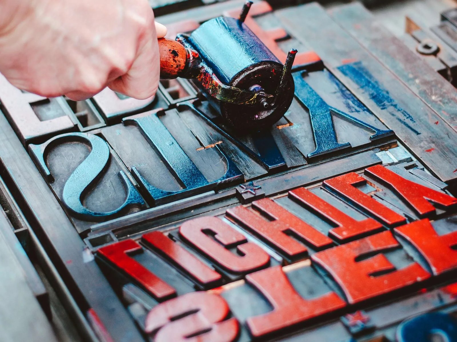
In the search for personalisation and flexibility, typography plays a fundamental role in building identities. Compared with the other visual elements (the logo, images…), letters are taking on ever more prominence and are now a key differentiating element in the world of brands.
From large fonts with more marked, expressive typography to finer, cleaner lines, the coexistence of different typographic structures raises the discourse and conveys the concepts on which brands are built, unifying every touchpoint to establish a direct relationship with consumers.
A trend in which the possibilities are endless. Conventional fonts, fun and experimental typefaces, futuristic ones, textured ones… Here design breaks the rules to show that well-implemented text structures can attract as much as images.
Acronyms, short phrases, clear messages and adaptive texts in groundbreaking typefaces currently dominate brand worlds, giving personality and championing the power of the font and the word.
Cases
01 / 04Zorraquino spotlights
- 01
In wide brand worlds, fonts and type design are taking on ever more prominence compared with other visual elements.
- 02
Brands are opting to design their own typefaces or to use groundbreaking fonts that bring personality and differentiation.
- 03
Through the design of typographic structures, brands manage to position their discourse and unify their touchpoints with people.
More on the trend
References
- Las tipografías experimentales, el estilo minimalista, el modo oscuro y el diseño 3D marcan la estética del nuevo año
- ¿Qué cambios vamos a ver en 2023? Los expertos en branding hablan
- Logos 2023: las 9 tendencias que debes conocer
- A change of typeface: Microsoft’s new default font has arrived
- Liberty letters
- LaLiga presenta su nueva identidad visual definitiva
- Primarium
Pages 79–89 of the report